Aesthetic Emotion
A lot of times I get stuck in the drawing process before I even begin. I do I'm thinking too hard about what I want to "draw". I watch my kids do the same thing and my advice to myself and to them lately has been to just get it out. Just put it on paper as fast as you can and then move on...
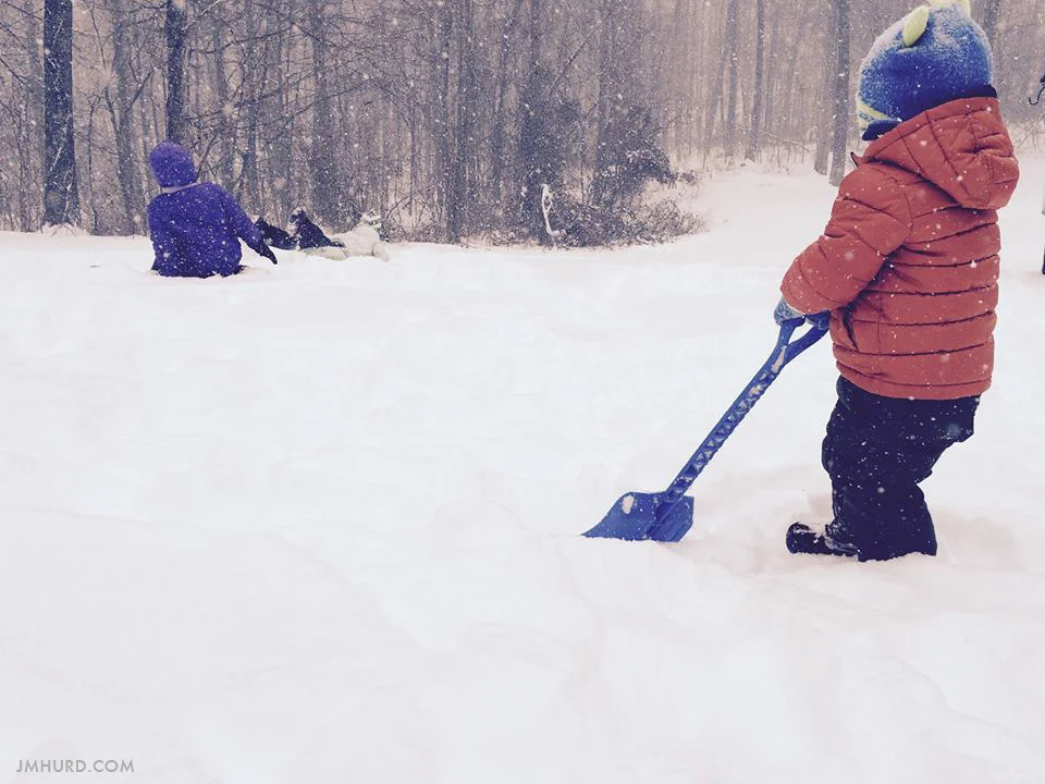
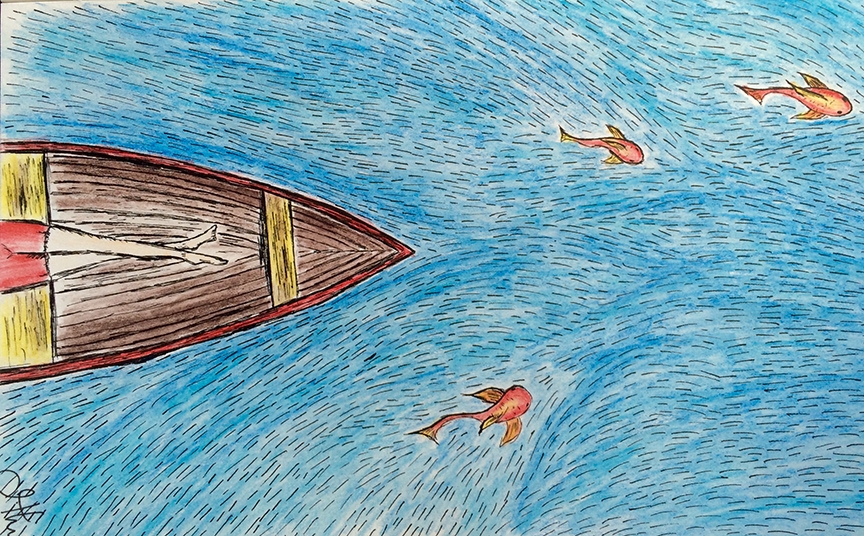
Pictures in the snow
It's beautiful here in Kentucky right now... to me at least. I grew up in Connecticut and as a child became accustomed to ice cold winters with lots of snow, but I've spent most of my adult life living in North Carolina where winters are pretty lame.
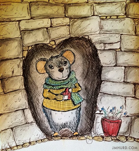
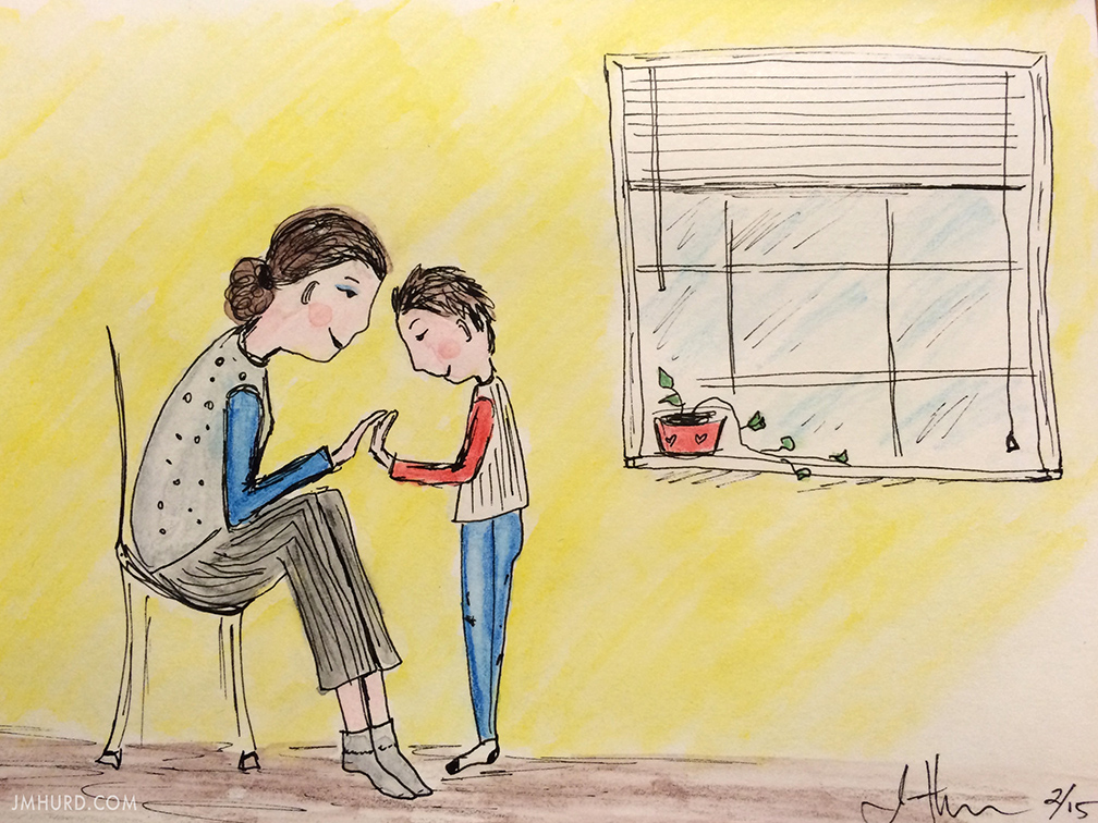
A Valentine's Day Sketch
Every year that goes by I tell myself I'm going to try next year to be more festive. So here it is, Valentine's Day 2015 and I think I did an ok job in my attempt to get into the mood of this particular holiday. I'm wearing red, I'm baking a sweet treat for my kids and I drew this cute little Valentine's Day mouse. :)
What is creative flow?
Sometimes when I talk to my artist friends we joke that our clients think we have a magic wand that we can wave and create with. It’s definitely just a joke, I have no such thing, but to be honest there is something a little magical about the creative process. Realistically and for those who don’t believe in magic, it’s a purely physiological process.
Moving... Next Week!
You know that surreal feeling? That's how I felt this morning. I sat down to make my list of things to do today, looked at the date and realized that on this day next week I will be helping my husband load a U-Haul. Next week, January 31st (yes the day before Super Bowl) we will be on our way to Kentucky.
Feeling Imaginative
When I was a kid I was always day dreaming. My imagination was so alive it was almost uncontrollable, especially in 4th grade math class where I missed out on foundational math because I was too busy drawing happy troll looking characters on my desk and giving them haircuts with an eraser or escaping to the away dreamlands that would spill onto my paper.
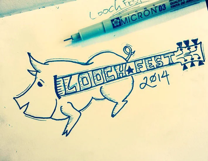
Loochfest Logo
My little brother, Cory, called me a few months ago and said "Jack, I need you to design a kick-ass logo for Loochfest, I want it to incorporate a pig and a guitar." And that was it, that was his vision.
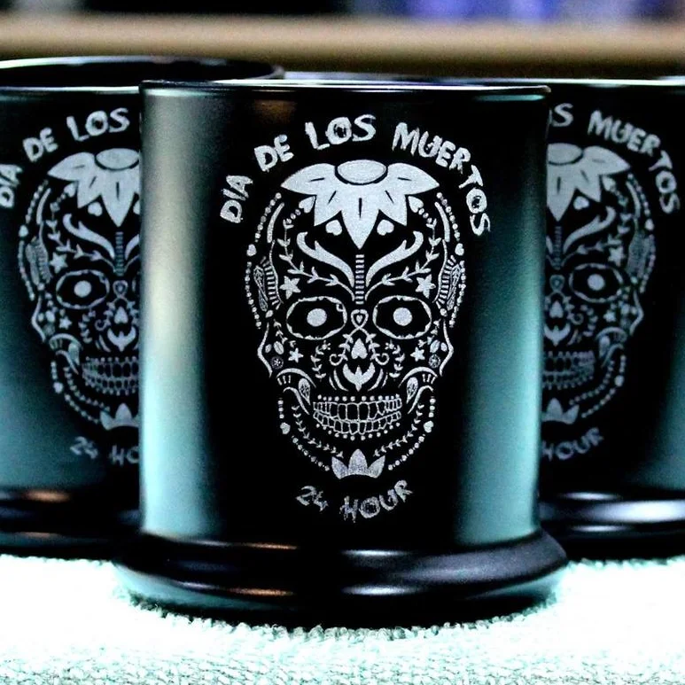
Dia De Los Muertos style logo
I designed this logo a few months ago for the Dia De Los Muertos 24 Hour Endurance Challenge. The inspiration of course came from the classic sugar skulls that usually surface everywhere around Halloween. Here's a few words about my design process for this project.
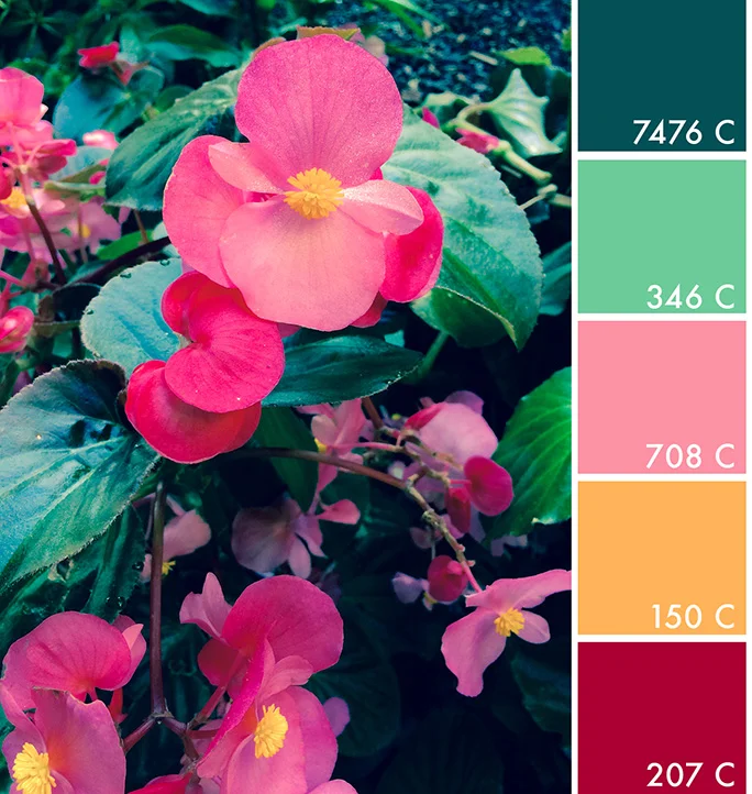
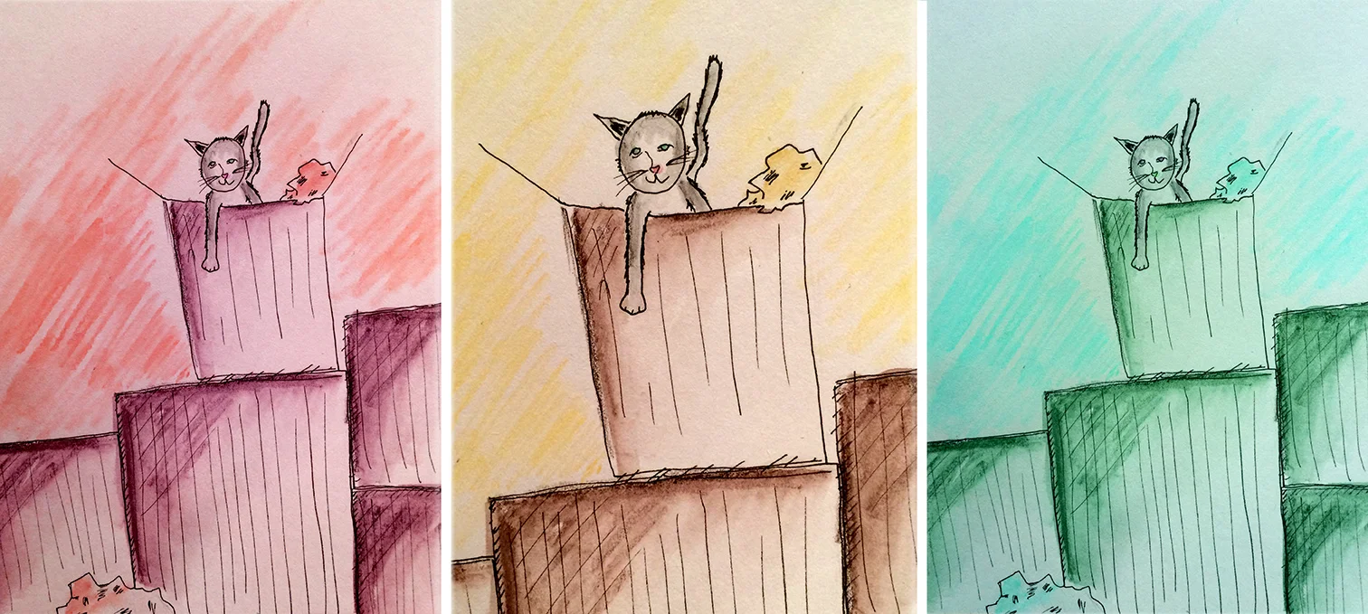
Color Theming
I took this photo with my iPhone outside of the hotel we were staying in while visiting the Biltmore in Asheville, North Carolina. The yellow and pink of the flowers caught my eye, mostly because it's mid-October and the flowers were still so lively.
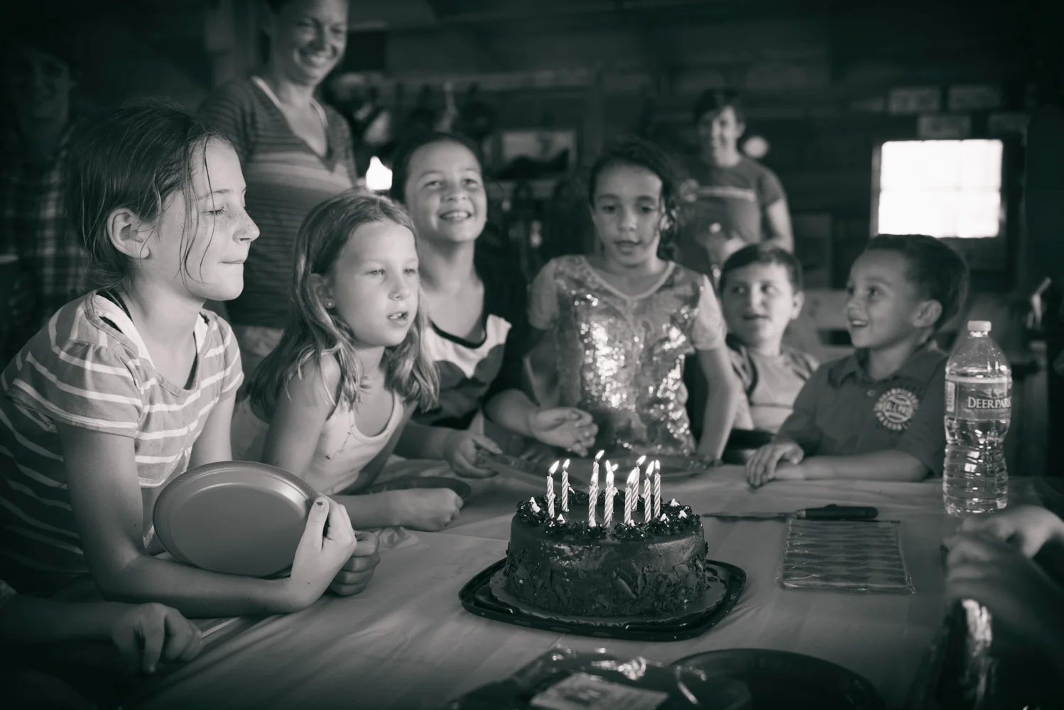
Birthday Magic
It’s surreal to think that 10 years ago I became a mother for the first time.