Completed projects, Illustration Jackie Hurd Completed projects, Illustration Jackie Hurd

Produce Illustrations for Freshlist

Fruits and vegetables are at the top of my “favorite things to draw list”. I was very happy when a project in the form of fruits and vegetables came my way back in August when I got an illustration request from a Charlotte, NC based food delivery company called Freshlist.

Fruits and vegetables are at the top of my “favorite things to draw list”. I was very happy when a project in the form of fruits and vegetables came my way back in August when I got an illustration request from a grocery delivery company in Charlotte called Freshlist. One of the founders, Jesse, reached out and asked if I would be interested in illustrating produce for a giant seasonal clock he planned to have painted on the side of the Freshlist building. Of course I was interested! When it was time to start the project, Jesse sent me over a list of over 50 produce items- it was like a long grocery list but instead of delivering groceries I was to deliver persimmons, kumquats, okra, lemons, limes, collard greens and more in the form of vector illustrations. There were a few things I had never heard of like Paw Paw fruit and that took me down the rabbit hole of information, especially when I realized I could potentially find a paw paw tree in the woods near my house. I drew a few of each item on the list by hand using a .01 Pigma Micron pen. Freshlist is a company with a very down to earth organic vibe- they work directly with local farmers and food makers to deliver fresh, local food to their customers, so I wanted my illustrations to have that same feel to them. After everything on the list was drawn and approved I converted the drawings to vector and added color. These illustrations were then turned over to a local Charlotte artist who did an amazing job painting them onto the wall. The finished product is a large, colorful and functional seasonal clock. I love projects like this and it’s a great feeling to know I was able to play a role in contributing to the beautification of a community.
To learn more about Freshlist, visit Freshlist.com

Produce Calendar SM.jpg
Illustration Stack.jpg
IMG_3444.jpg
Read More
Graphic Design, Completed projects Jackie Hurd Graphic Design, Completed projects Jackie Hurd

Free Font!

It took me forever, but I finally got around to using the fontself maker plug-in to make a font. It’s not perfect but I did it and I’m sharing the font with anyone who wants it. So here it is and a quick read to go with it.

A work in progress shot. Quick and chunky did the trick.

A work in progress shot. Quick and chunky did the trick.

A few years ago I bought a license to Fontself Maker and had grand plans to start making my own fonts. I installed it, opened it and never used it. At least once a week since then I would get the fontself newsletter, feel guilty about having had spent money on something I wasn’t using and think I really needed to set some time aside to make a font. Sometimes I’d get as far as drawing out (a few) letterforms but then I’d abandon task, mostly because I was seriously overthinking it. Even now as I’m typing this I’m thinking “is letterform the right word to describe a letter”. Anyway, today was the day. My son made a huge mess on my desk with chalk pastels and as I was cleaning them up I felt compelled to see what the alphabet would look like if I wrote it with the squared off shape of the pastel. It looked pretty good and it took me less than a minute! I took a picture of my work, drew over it on my iPad (using procreate) and then after converting everything to vector art, I used the adobe illustrator version of fontself to create my font. Fontself Maker was surprisingly easy to use- after I read the directions- something I had previously failed to do. So here’s my font, I named it "Cappy the first” because it’s all caps and it’s my first successful try in Fontself Maker. Go ahead and give it a try (personal use only please). It’s not perfect and I’ve still got a lot to learn, but I did it! I plan to practice in the coming weeks so hopefully I’ll have another fun font to share soon!

If you’d like to make your own font, here’s a link to get 10% off Fontself Maker. The plug-in is available for Adobe Illustrator, Photoshop or both.

Read More
Graphic Design, Completed projects Jackie Hurd Graphic Design, Completed projects Jackie Hurd

Newish design for Birdsong's IPA Series

New year, newish design for Birdsong Brewing Company’s 2019 IPA series.

New year, newish design for Birdsong Brewing Company’s 2019 IPA series. Here’s the first of them with the patterned background that’s been affectionately called the Hopsaic. It’s a bigger and blockier version of the design I did for them last year.

I hope everyone loves this one as much as they loved the last one! To see more of my art on their cans, check out Birdsong’s Instagram. 

53075106_2212505145472605_8100953467293532160_o.jpg
2019 Hopsaic.jpg


Read More
Completed projects Jackie Hurd Completed projects Jackie Hurd

Hens in the Garden

Most of my designs have a story. Read about how my “Hens in the Garden” collection came to be. Post also contains a link where you can buy it as fabric, gift wrap or wallpaper.

Every year when it warms up my husband and I get excited about having a garden. We plant a little bit of EVERYTHING which is always way too much, get excited when things start to grow and then loose interest as the weeds and bugs take over. This year we decided to approach things differently. We bought already started plants and only what we knew we'd eat- lettuce, broccoli and herbs. Everything was doing great and then after getting the back yard fence installed, we decided to let our 6 hens out of their coop. Within minutes, possibly even seconds, they ate every single head of lettuce in the garden. They didn't touch anything else, just the lettuce. Apparently, hens really like lettuce.

We now have an additional fence around the garden to protect our recovering lettuce, but from this experience I was inspired to create this collection of designs called "Hens in the Garden" each design is now available for purchase on Spoonflower as fabric, gift-wrap or wallpaper. Since I'm a seller on Spoonflower but not a sewer, I'm hoping someone will buy a few yards and make something adorable so I can see these designs come to life! I think these chickens would look great on aprons or teatowels!

Buy a few yards from this collection, sew it into something awesome and tag me on Instagram!

Buy a few yards from this collection, sew it into something awesome and tag me on Instagram!

Read More
Completed projects Jackie Hurd Completed projects Jackie Hurd

Loochfest Logo

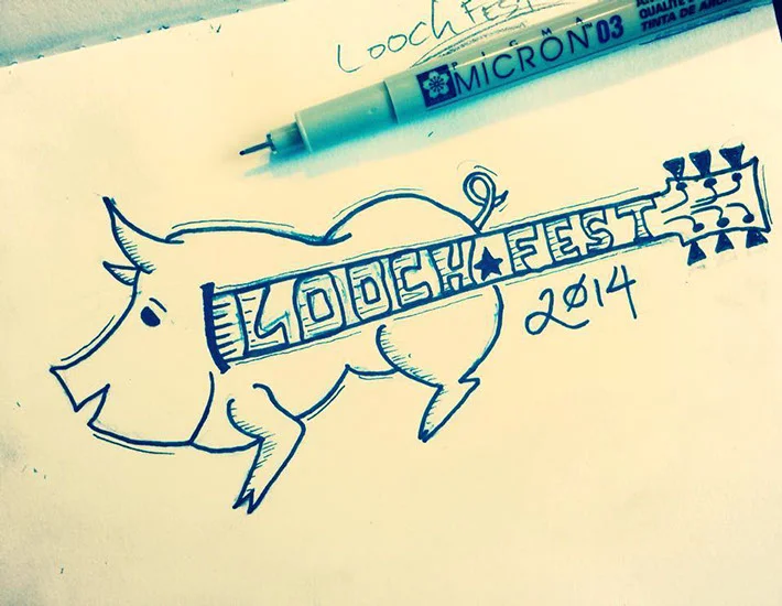
My little brother, Cory, called me a few months ago and said "Jack, I need you to design a kick-ass logo for Loochfest, I want it to incorporate a pig and a guitar." And that was it, that was his vision.

The beginning, Loochfest logo in my sketchbook

Re-creating my sketch in Adobe Illustrator with the pen tool. That old school color theme up in the corner is the one I went with for a color pallet. 

My little brother, Cory called me a few months ago and said "Jack, I need you to design a kick-ass logo for Loochfest, I want it to incorporate a pig and a guitar." And that was it, that was his vision. Last year Loochfest was a small gathering of family and friends out at my bonus dad's* house so I didn't take it very seriously plus I had real work to do. I put it off and put it off and finally (because when I procrastinate it eats at my soul) I called Cory and asked why it was such a big deal this year. We had a good conversation about his intentions for the event. Apparently, he wanted it to grow from a 20-30 person family gathering to a 300+ person charitable music festival. He wanted to charge for tickets so he could donate the money to a local organization that would benefit veterans. He felt like having a solid logo would make the event seem more legit. After our conversation his need for a logo made more sense. I asked my kids if they had any ideas and they immediately came up with a "piguitar". With that I was instantly inspired. Moments later the piguitar was born in my sketchbook. It was pretty rough at first. Once I took it into adobe illustrator and cleaned it up it started to shine. I ran into a little bit of a creative block when it came to the font. Nothing was working. The piguitar needed a handrawn playful font but nothing too decorative or whimsical. I finally found a great font on Behance called Chomp. The font was created by William Suckling of Camberwell, United Kingdom. It was exactly what I needed and with a few adjustments it completed the design. For the colors I went to my favorite source of inspiration, Adobe Kuler and tried out a few different color themes, finally settling on a combination of vintage colors that worked out perfectly. I finished up the logo and Cory was impressed, I think I exceeded his expectations. I'm sure he'll be a return client, especially because he gets design services at the family rate.

The day of the event rolled around last week. When I arrived with my family there was quite a crowd! There was a stage set up with sponsor banners, a multiple band line up featuring reputable bands from all over North Carolina, to include Cory's own bands. Awesomely delicious pork bbq was being served up around the clock with a spread of beans, coleslaw and a few other backwoods selections. 

I'm looking forward to next year's event! Apparently my little brother knows how to throw a party.
And now that we've got the logo down, it's time to come up with some Loochfest swag!

I can't forget to mention, all proceeds from this event went to the Randolph County Chapters AMVETS Post 905 & The VFW

Here are a few not so great photos I snapped with my iPhone. I didn't have my camera with me. My husband wanted me to "relax" and enjoy the event. Attending Loochfest without my camera made me realize that it's really hard to enjoy an event when I'm not behind a camera!

*I should probably define bonus dad because it's going to come up quite a bit in my blog posts. Here's a quick back story.. Jim is my mom's ex husband. However, they were married for my entire childhood, he raised me. At the same time my dad has also always been in the picture and we've always had a strong bond, I love him. I love them both... I have two dads. My dad Dan, and my bonus dad Jim.

Read More
Completed projects Jackie Hurd Completed projects Jackie Hurd

Dia De Los Muertos style logo

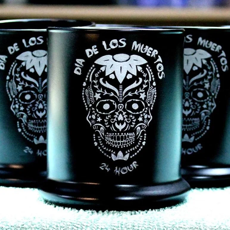
I designed this logo a few months ago for the Dia De Los Muertos 24 Hour Endurance Challenge. The inspiration of course came from the classic sugar skulls that usually surface everywhere around Halloween. Here's a few words about my design process for this project. 

I designed this logo a few months ago for the Dia De Los Muertos 24 Hour Endurance Challenge. The inspiration of course came from the classic sugar skulls that usually surface everywhere around Halloween. They have become quite trendy here in the U.S. but digging into their origins, the sugar skull actually has a very unique history. They first surfaced in 17th century Mexico when Italian missionaries brought the art of sugar molds to the country. Sugar skulls are exactly what the name is, skulls made from sugar created out of clay molds. These hand-crafted skulls come from a cultural holiday celebrated in Mexico with Aztec origins, Dia De Los Muertos, or Day of the Dead. The holiday is one that commemorates and celebrates the deceased. The skulls are created to represent departed souls, with their names on the foreheads. They are elaborately decorated with happy designs and bright colors. 

As with everything, I started my process for this design on paper. I printed out a basic skull and traced the form. I filled it in with different flowers, swirls, and whatever random elements flowed through my pencil and onto my paper. I then traced over everything with a Pigma Micron pen. I do this so for two reasons, one is that I can get a better idea of how the final product will look and the second is when I bring the design into Adobe Illustrator and vectorize it, all the lines can be found by the software. For simple logo concepts this process usually works well and provides a good foundation for the next step but with this one I wasn’t satisfied with the conversion so I ended up tracing over almost all of the elements once they were vectorized and recreating them with the pen tool. To save on time and maintain consistency throughout the design, I also created a few custom brushes for this project. Once I had everything created on the right side, I copied and flipped the elements over to the left side so that everything would be symmetrical. 

Brushes created for this project

The beginning. Tracing over my pencil drawing with a pen. 

Working it into a vector drawing. 

Working it into a vector drawing. 

The final result was exactly what I had envisioned, I'm really happy with how it turned out. Another local artist that I frequently collaborate with for detailed woodwork and other engraving products, Lawrence (Itslaser engraving), used the logo to create these awesome candle holders that will be used as finisher’s prizes for the race. He engraved the artwork onto the glass. Turned out awesome!

Photo and engraving by Lawrence Covain

Read More
Completed projects Jackie Hurd Completed projects Jackie Hurd

Delta Dawgs: a logo re-draw for an Army unit

A logo re-draw for an Army unit. 

Delta Dogs

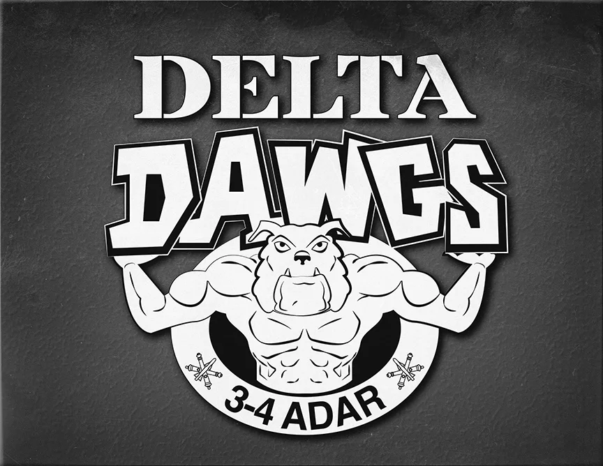
Since my career started as an Air Force graphic designer, military artwork of any sort is my favorite type of project. I especially love doing unit logo redraws. This one was done for 3-4 ADAR, an Army unit on Fort Bragg. What they originally had was a hand drawn logo (below). The only file they had of it was a low resolution jpg so use of their logo was limited.

To recreate this logo I basically traced over the original the best I could (I use adobe illustrator) to keep it in line with the original hand drawn version. I left out a lot of the additional detail and added some spacing to the text to give it more room to breath. 

Delta Dawgs T-shirt design

This is the original Delta Dawgs image

Read More
Completed projects Jackie Hurd Completed projects Jackie Hurd

Logo & Identity for Collette Zimmer Dressage

Read about the inspiration behind my most recent project, a website and logo design for Collette Zimmer Dressage. 

Last month my friend Collette and I went for a run. Collette is an equestrian, a Dressage rider to be exact. I am an artist. I quickly realized that Collette who also happens to be training for her first ultra marathon, runs much faster when she talks about horses. So we talked horses, well, she talked horses and I listened. During this running conversation about horses we talked about her plans for the future and those plans of course involved horses. By the end of our run I had her convinced that she needed a website with a blog to showcase her talent and growing career in Dressage. 


The inspiration behind the Collette Zimmer Dressage Logo.

The inspiration behind the Collette Zimmer Dressage Logo.

A website can be quite an investment of both time and money so I only half expected that I would be building a website for Collette.  However, a few days later, Collette was at my kitchen table eager to get started. 

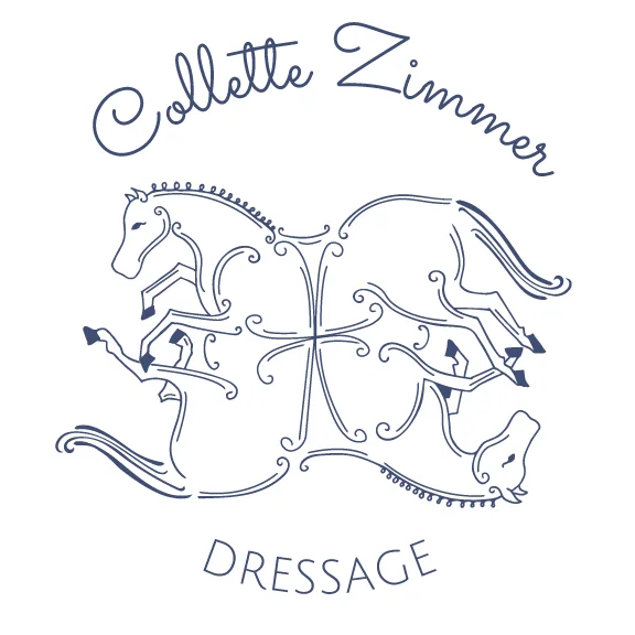
Collette was so sure of what she wanted for her website that it only took me a few days to get it built and launched. Realizing the potential that comes with an active blog, she began blogging right away and of course that got her thinking about the next step- an identity for the brand that she now has thanks to the website. She sent me an image of a 17th century painting and asked me to create something similar. At first I didn't notice that there were actually 4 horses interlaced so my first attempt was a flop but not a bad flop and she almost settled. As a designer, I don't like the idea of settling so I had her over for breakfast one morning to have an extended conversation about what she was looking for. During our conversation she pointed out what she had been trying to explain over text messages. Collette's idea came to life as I did a rough sketch over the painting and made adjustments with her input. Soon enough, the lines all fell into place and after a few hours of digital tweaking, the logo for Collette Zimmer Dressage was complete. 


The logo works nicely as a stand alone or it can be used in one of the three variations provided. For the font I chose Julius Sans One and thanks to google's font pairing guide I discovered Sacramento. These two fonts look lovely together and are in perfect harmony with this logo. All of this carries over to her website as well as the other business materials that are next on the list of items to create for Collette Zimmer Dressage. 

I'm very excited for my friend, she has a lot of knowledge and experience with horses. This is her life, it's her career. Now she has a place to put all of her information, share her stories and attract potential clients who I hope will be wowed not only by her knowledge, but also by the presentation of her brand. 

To learn more about Collette Zimmer Dressage visit www.czdressage.com and be sure to like her Facebook too. 

Read More