

Before the Pattern: From Pen to Print


This post contains affiliate links. If you choose to purchase through them, I may earn a small commission at no extra cost to you.
Thank you for supporting my creative career!
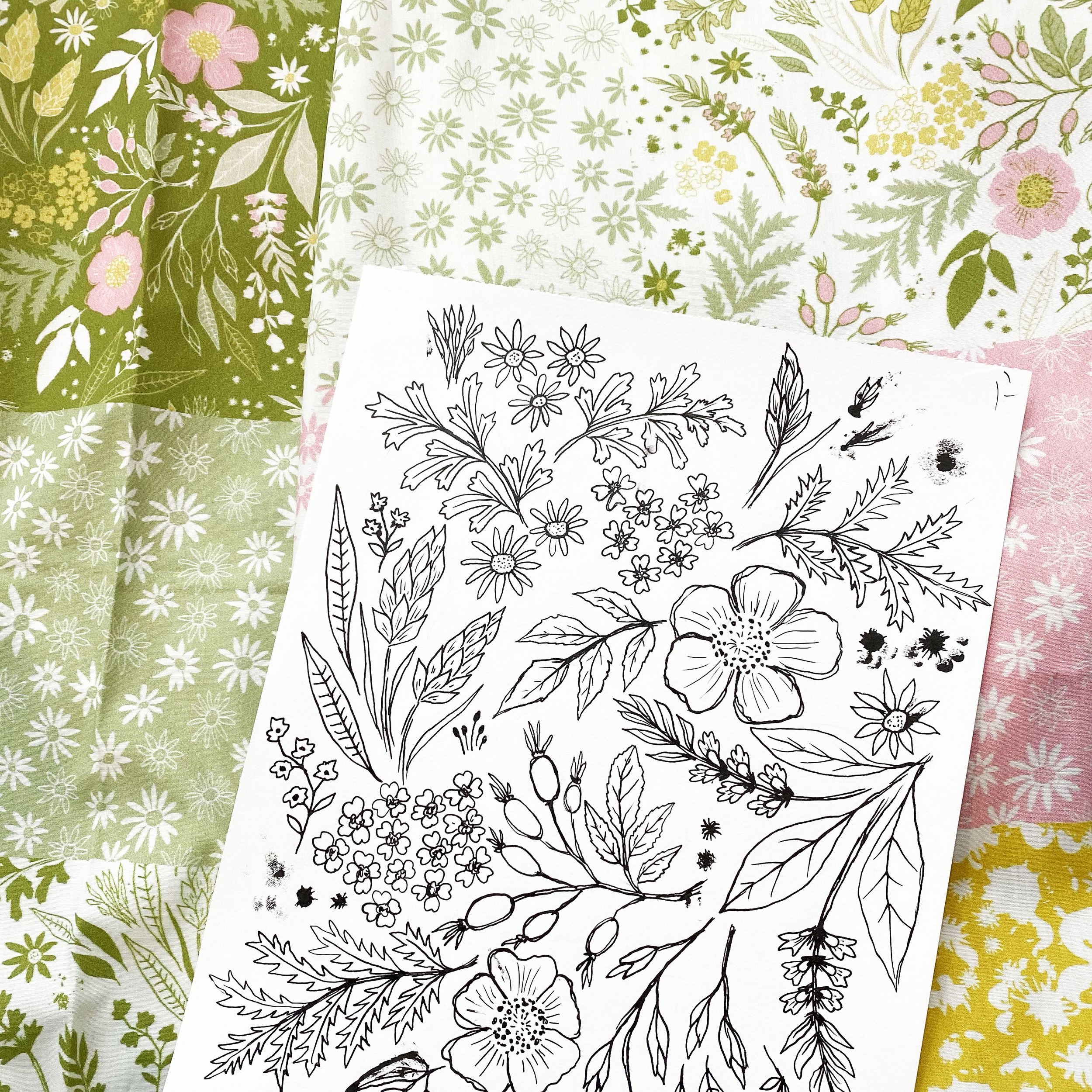
Creating a pattern is as much about the tools as it is the vision, so I thought it would be fun to show you what goes into my process and the tools I use before the digital magic begins. This desert-inspired design started as a collection of simple sketches and evolved into a complete, whimsical repeat pattern. Let’s break it down.
The Canvas: Canson Mixed Media Pad
For my drawings, my preferred medium is the Canson Mixed Media 9x12 pad. It’s a great size—large enough to work on multiple illustrations on one page without worrying about the final drawings being too small. The paper itself has just the right amount of texture (or “tooth”) to keep the pencil flowing but not so much that it interferes with fine details. It’s a reliable starting point for any design.
Sketching Tools: Tombow Mono Graph Pencil
The Tombow Mono Graph pencil is a favorite in my toolkit. Its unique shake-to-advance lead mechanism adds a layer of efficiency to my process. No clicking or twisting to interrupt the flow—just sketch and shake. Simple, satisfying, and endlessly practical.
Inking the Details: Derwent Line Marker
When it comes to inking, I believe the tools you choose define the mood of your final design. For this pattern, I skipped my usual India Ink and nibs (great for bold lines and a little unpredictability) and instead opted for the Derwent Line Marker (0.1). Its finer linework added a softer, more rustic quality that perfectly suited the Western Americana theme I was going for.
Precision Erasing: KUM Eraser
Mistakes happen—it’s part of the process. That’s where the KUM eraser shines. It was the eraser I never knew I needed until I received one as a gift a few years ago. Its pencil-like shape makes it easy to handle, offering precision for minor tweaks as I work.
Large Kneadable Eraser
For final cleanups, a large kneadable eraser is a must. It clears away any leftover marks without leaving residue, giving me a clean, polished page to scan. It’s also great for fidgeting!
From Sketchbook to Screen
Once the illustrations were complete, I scanned them into my computer and moved to Adobe Illustrator for the final steps. It’s here that my raw sketches were transformed into a cohesive repeat pattern. Illustrator allowed me to refine the shapes, adjust colors, and ensure every element fit seamlessly into the final design. I’ll share more about that process in another post!
Creating patterns is a mix of tactile and digital work, and I love seeing how each stage of the process builds on the last.

Big Changes for Spoonflower for Artists
Spoonflower recently announced a few big changes that will have a significant impact on artists who contribute to their platform. Here are my thoughts on the upcoming changes.

For those who may not know, I've been selling my designs on Spoonflower since 2016. Spoonflower is an online marketplace where designers can upload their patterns, and they can then be purchased on fabric, wallpaper, and home decor. Back then, gift wrap was also an option (I wish it still was). Through Spoonflower, my passion for surface pattern design grew and completely changed the course of my focus as an artist, especially once royalty payments from my designs started to become more than pocket change.
In 2021, Spoonflower was acquired by Shutterfly. This acquisition was presented to us artists as something that would be beneficial and allow for growth on both ends. At first, I did see a lot of growth. This year, however, things are much slower for me, and it's been a little discouraging. It's hard to tell if the slowdown is due to growing pains from the acquisition or because of world events, the state of the economy, etc. But could things be changing for the better?
Starting January 2024, Spoonflower will be changing the way they determine royalties, in addition to what I consider to be a few more really big changes. While it's easy to get caught up in the fear that comes with changes like this, I am choosing to be optimistic and hoping these changes will bring some light back into the tunnel that I'm trying to work my way out of! So, let's explore these changes, and I'll tell you what my thoughts are.
Royalty changes
Royalties start at 10% and increase up to 15% depending on an artist's threshold of sales. Our commission used to be based on the original retail price; the change will base it off the sale price. The concern among artists is that this means less overall income. However, my thoughts are that this will allow Spoonflower to have more sales, making the purchase more appealing to buyers who might otherwise just be window shopping. I haven't met anyone who doesn't love a good sale, and sales often come with a sense of urgency. So while a 30% off sale means less commission on that particular sale, it could also mean many more sales that we wouldn't have otherwise had. My hope is that this is a good thing.
Free proofing with a limit of 25 designs a week.
Swatches start at $5.00, less if you have a Pro account or do it through the Fill a Yard option. My point is, this adds up. Over the years, I've spent a grip on swatches, and some of these designs have never actually sold. In addition, artists have to write in to get new scales of previously proofed designs up for sale.
Effective December 31, 2023, artists will no longer have to purchase swatches to proof their designs. They will use a digital proofing tool. Currently, Spoonflower designers have to purchase swatches of their new designs to proof them before making them available for sale. This sounds a little scary, and some of us artists are concerned that this will open the platform up to spammy accounts and designs or it being taken over by endless AI-generated art. I share this sentiment, but I trust that Spoonflower has thought this through and has a plan to stay on top of this potential issue.
With those concerns aside, I think this will be a huge relief for some very talented artists who are currently not able to make their designs for sale as often as they'd like because of the cost. I think this is also going to free up the staff and the printers at Spoonflower, which will result in faster production times.
In addition to free proofing, there will also be a limit of 25 designs a week. This seems limiting, but I understand the need for a limit. I personally like to create multiple scale and color options for a lot of my designs, as do many other artists. I don't have much to say about this one at the moment, but I am hoping Spoonflower has something in the works for scale adjustments. I don't mind creating the color variations, but having to upload four different scales of one design seems like a way I'd rather not use up my 25 weekly design slots.
De-listing Stagnant Designs
If a design hasn't sold in over 2 years or doesn't have at least 50 likes, it will be de-listed. This is the announcement that seems to be getting the most attention. In my previous point, I touched on the cost of the swatches required to proof. A lot of artists are upset about this because they've paid to proof those designs. At first, I was also a little disheartened to read this, but after looking through my own shop, I've seen plenty of designs that no longer reflect my current skill level. If our Spoonflower shops were a real storefront, those stagnant designs would be taking up valuable shelf space, and that could be overwhelming for a customer. This will be an opportunity for many of us to review old designs for either a refresh or retirement.
I have a lot more thoughts on these changes and some ideas for saving those designs that just haven't had a chance to shine because of competing designs, but I'll save that for another post. I just felt like I needed to write something about these upcoming changes to the Spoonflower platform and hopefully bring some optimism to the topic.
Resources:
-
Hi Spoonflower Artists!
As we continue to listen to your feedback and listen to our shoppers’ feedback, we have a round of important upcoming site updates to share with you. These changes will go into effect starting in December 2023 and will apply to all designs as of that date.
New – Free Digital Proofing
Exciting news! Effective December 31, 2023, you will no longer be required to purchase proofs of your new designs to make them for sale. Instead, you will use our new digital proofing tool, which will allow you to pan, zoom and review design edges. As always, there will never be a substitute for sampling your designs on physical products to gauge true color and feel, so we still strongly encourage this step. This is especially important prior to purchasing larger orders.
Weekly Listing Limits
While we are excited about digital proofing and the removal of the proof-purchasing requirement, we also want to meter an overload of newly made-for-sale designs to the marketplace. As there was no listing limit before, we have now set a limit of 25 made-for-sale designs per artist per week.
De-listing Stagnant Designs
We hear over and over from many shoppers that they feel overwhelmed by the number of search results, often receiving hundreds of pages and thousands of results to wade through. To condense search results, make new designs more discoverable and encourage more design diversity, we will be de-listing (making private) older, stagnant designs starting in January 2024. Some important points to understand:
The criteria for the possible de-listing of a design is that it is at least two years old, has not sold in the past two years and has less than 50 favorites.
We will test this out slowly and evaluate at various intervals before conducting a full rollout. So, it is not guaranteed that all designs meeting the criteria will be de-listed.
A de-listed design will maintain all data associated with it (number of favorites, who favorited it, whose collections it was in, etc.).
You will maintain the ability to re-list (make for sale) a design again, no questions asked.
A re-listed design will return to the marketplace with all data previously associated with it (number of favorites, who favorited it, whose collections it was in, etc.).
A re-listed design will not be eligible for involuntary de-listing for two more years.
Before you re-list, however, we would suggest asking yourself: Do I think this is a strong design? Is there something I could improve about the design before re-listing? Can I better optimize my title, description and tags for improved findability? Here are some tips on optimizing for findability.
You will be notified via your Spoonflower messages when you have designs that have been de-listed.
To see which designs have been de-listed, you will visit your Design Library and filter with a new “Previously for Sale” filter.
Donation of Manufacturing Waste
In lieu of discarding on-site manufacturing waste material from production of the products purchased through Spoonflower’s Marketplace that feature your designs, we may donate it to nonprofit organizations for educational purposes. Donated waste will be limited to flawed public designs only (not your private designs). Once the educational purposes are fulfilled, the nonprofit organization will discard the material.
New Tax Information System and Seller's Agreement
As required by the IRS, we must collect up-to-date tax information from all Spoonflower artists. This tax year, we're upgrading our tax information collection system to be more secure, accurate, easier to manage and available in more languages!
We are updating our Seller’s Agreement in connection with these changes. Your use of the Spoonflower site, including the sale of any designs through the platform, will be subject to accepting the updated Seller’s Agreement and submitting your tax information into our new system between November 28 through December 18, 2023.
We will send a reminder when the new tax information system and Seller’s Agreement are ready for your attention.
Sincerely,
The Spoonflower Team

Autumn Inspired-The Ghostly Garden' Collection
Read about my Ghostly Garden collection and find out where you can purchase these designs for your next project!
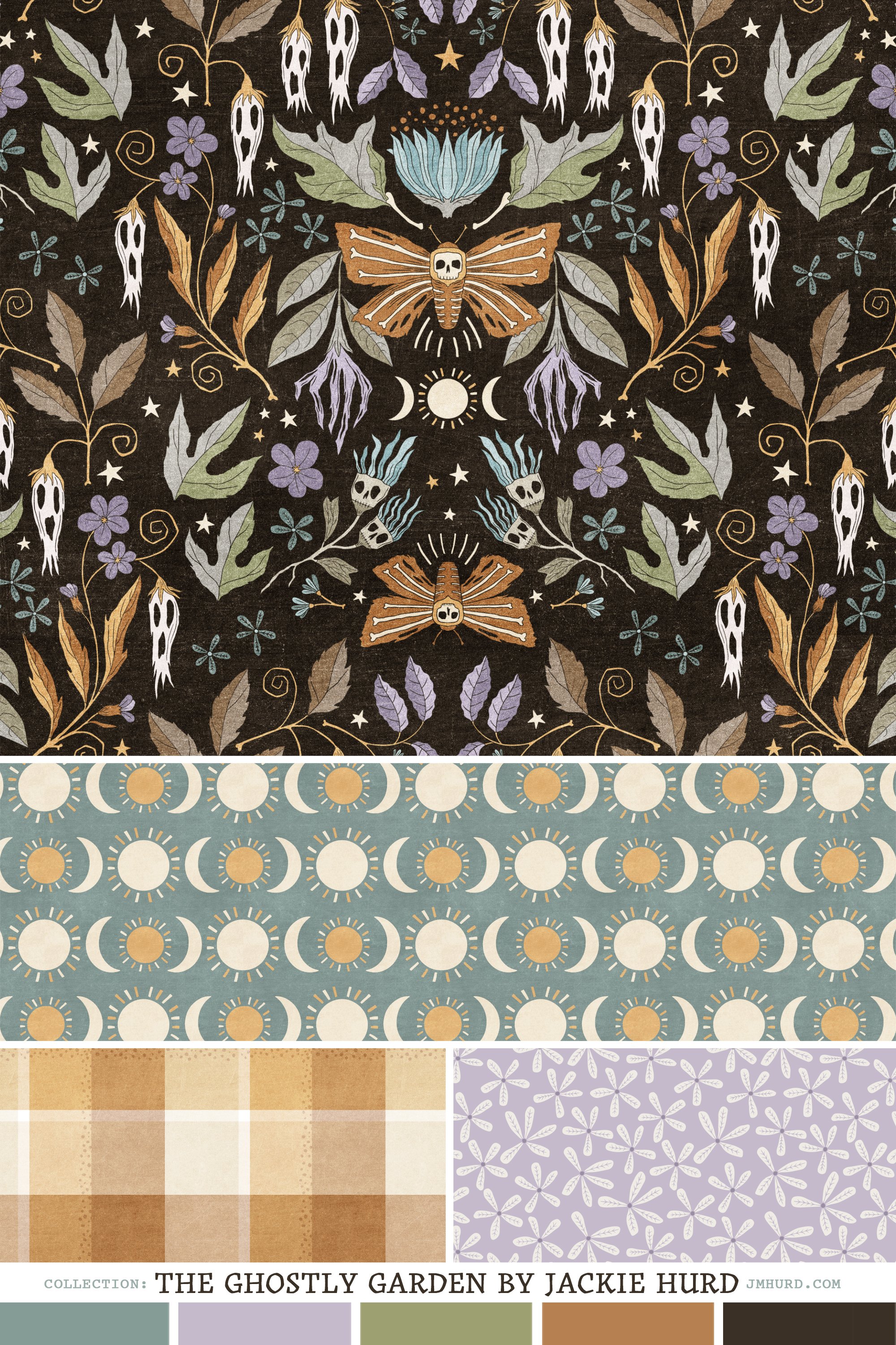
As the long, hot summer days slowly give way to the crisp embrace of autumn, I find myself eagerly anticipating the change of seasons. Perhaps it’s the Virgo in me, sensing the impending harvest. For me the harvest season signifies an abundance of inspiration. The air turns cooler, leaves dance from the trees, flowers gracefully transition to seed and my creative muse wakes from her summer slumber.
On the cusp of autumn, I found myself crafting the drawings for 'The Ghostly Garden' collection. The season’s inspiration seemed to start early! I used Procreate, leveraging its mirror option to help me envision the final patterns. Afterward, I refined the designs in Adobe Illustrator. I feel that this collection beautifully blends elegance with an eerie charm. The hero pattern for this collection is a moonlit garden adorned with skull and ghost flowers touched by the chill of late autumn all centered around the mysterious presence of the Death’s Head Hawk Moth. Coordinating patterns feature shining full and crescent moons, petite flowers in ditsy arrangements and textured plaids.
These designs bring a touch of witchy vibes and a hint of mystery, making them perfect for infusing the magic of chilly autumn air into home decor and sewing projects.
Whether you're seeking fabrics to transform your living space or envisioning unique sewing projects, 'The Ghostly Garden' collection is available in my Spoonflower shop.
I’d love to know what you think of this autumn inspired collection!

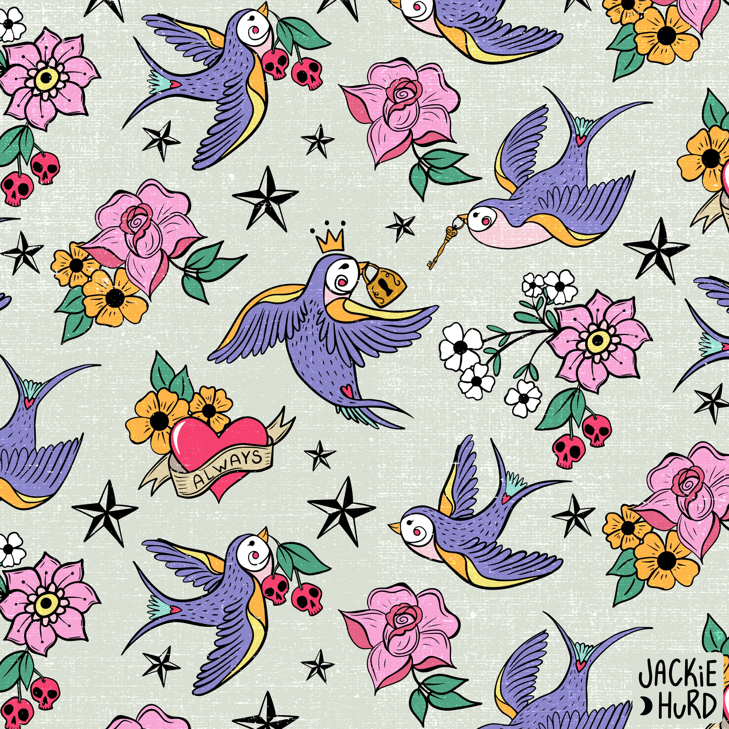
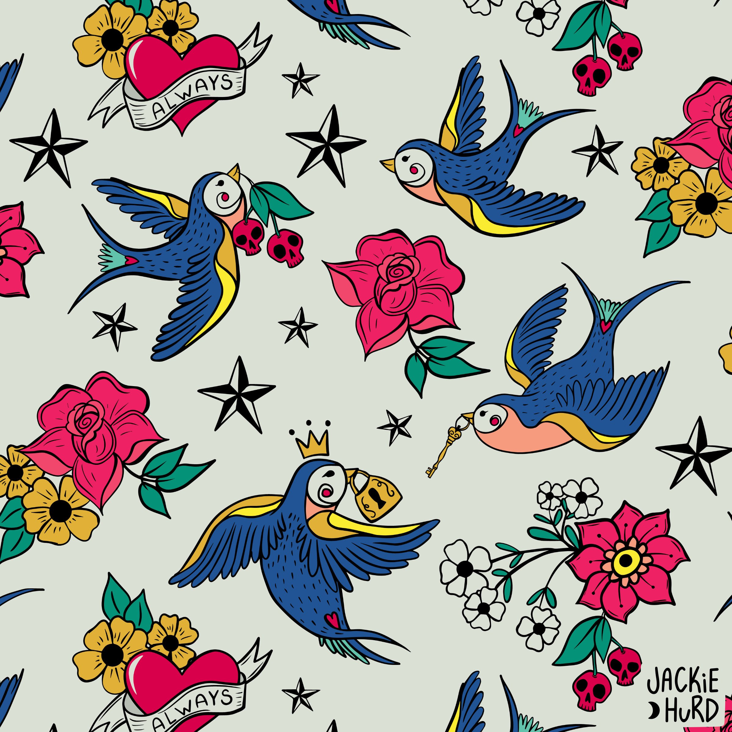
Pattern Revival- Rockabilly Birds
New year, new colors for my old “Rockabilly Birds” design.
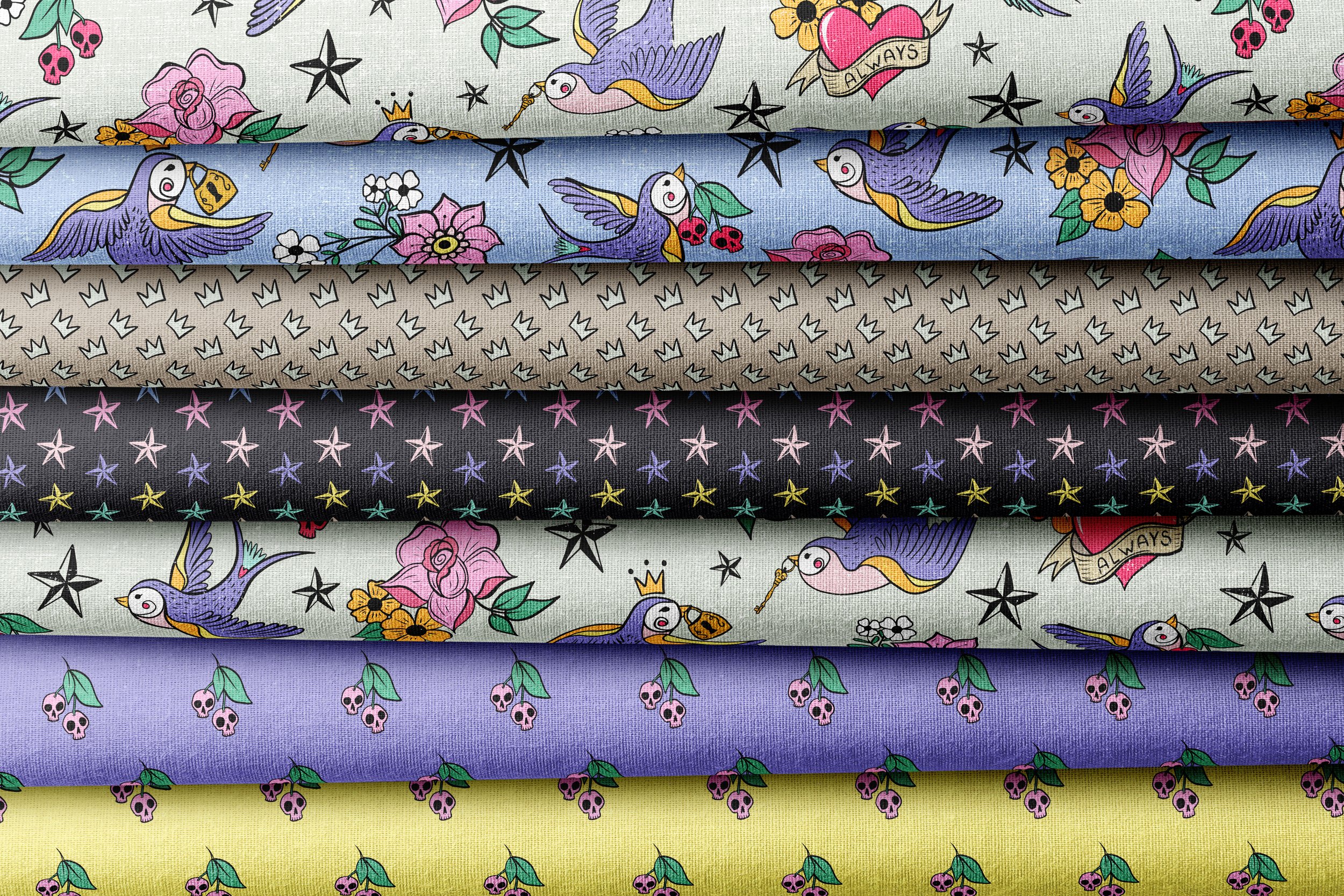
I created “Rockabilly Birds” for Spoonflower’s January 2019 design challenge. My entry placed 16th out of 302 entries. Looking at the entries from 2019, I am amazed to see how much the Spoonflower challenges have grown! These days there are usually 1,000 or more entires and it takes FOREVER to vote. If you are a fellow surface pattern designer reading this post, I’m sure you’ve seen those numbers too, but don’t let that dissuade you from entering. Even though the numbers are high and the talent is increasingly competitive, I still enter as many of the weekly challenges as I can. The challenges offer an opportunity for growth, community, and so much more. The weekly challenge also helps give the design you’ve entered a boost in the ocean of other designs on Spoonflower which in turn helps with future sales. For example, I have a few designs that didn’t even place top 60th that sell almost weekly.
The Rockabilly challenge was one of my favorites and I’ve always loved the design I entered. This week I’ve decided to dig it out (from my library of files), dust it off (open it in adobe Illustrator) and give it a new outfit (edit the colors). So here it is, a fresh version of “Rockabilly Birds” with more of a pastel vibe. I also decided this version needed it’s own fresh set of accessories (coordinates). The original design was blue with punchier pinks and yellows. I love them both, but if I could wallpaper my office in one, it would be the new pastel version with the light background.
Both versions of this design along with the new (and old) coordinates are available for sale in my Spoonflower shop on fabric, wallpaper and home decor items.

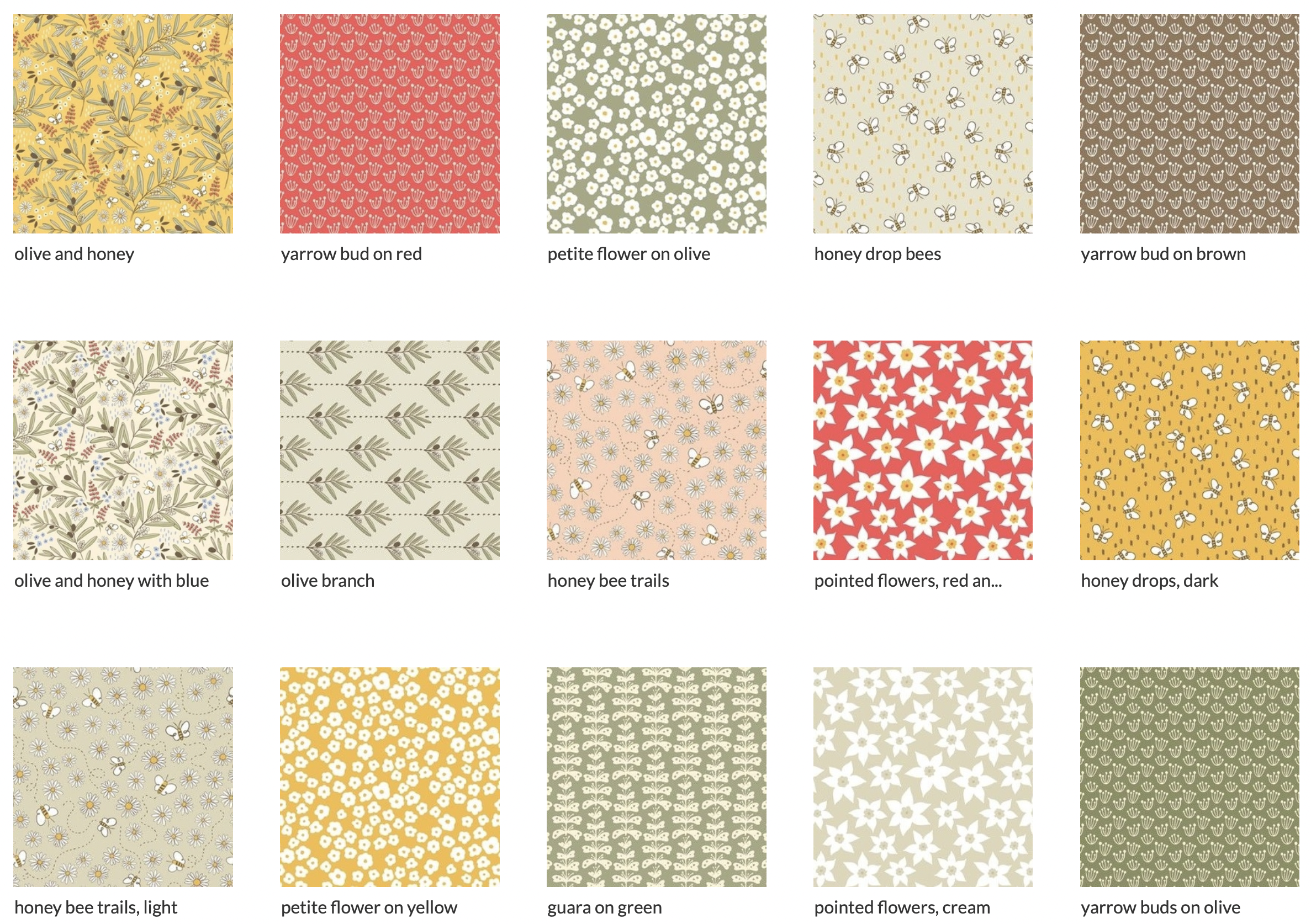
Collaboration! Laboratorio La Gufa
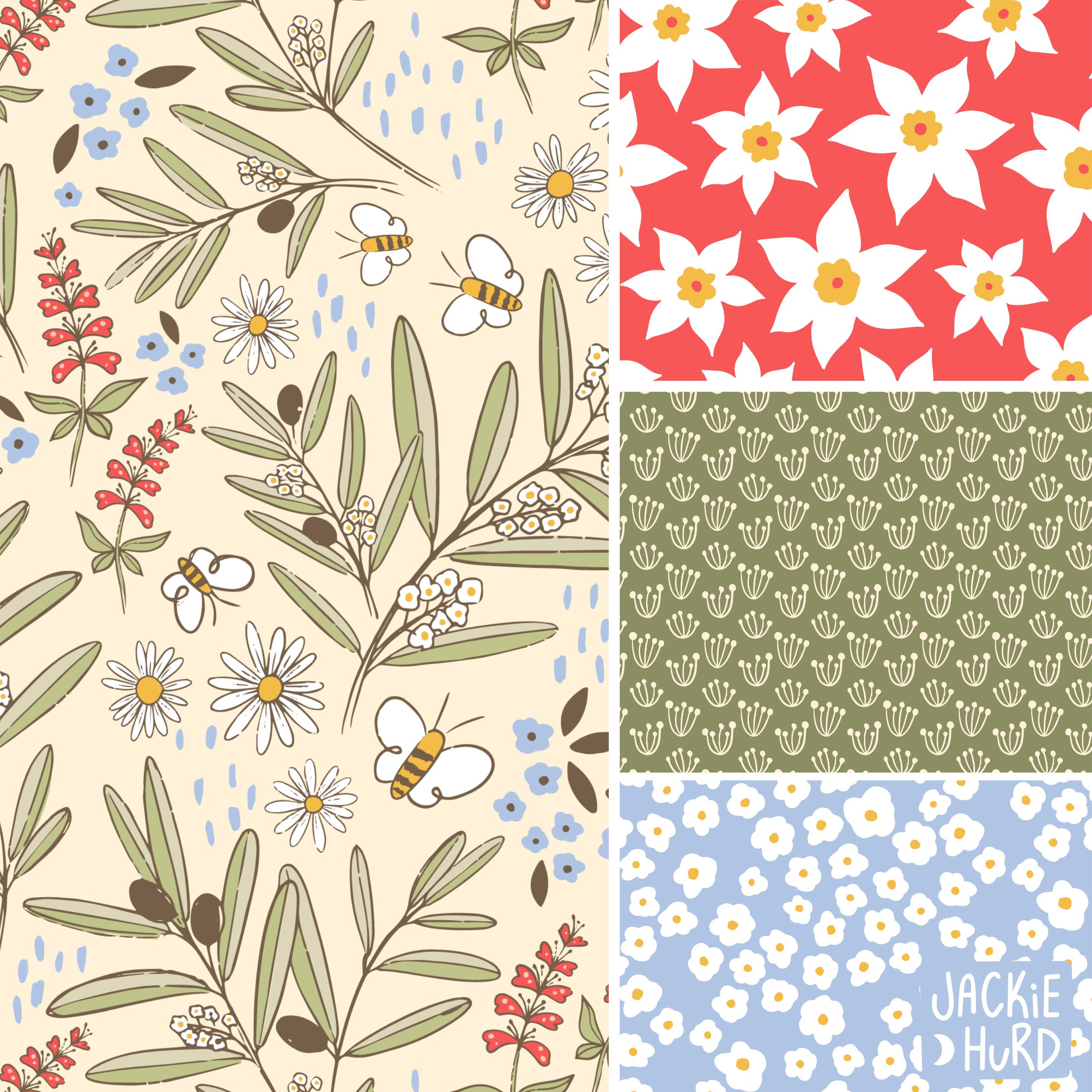
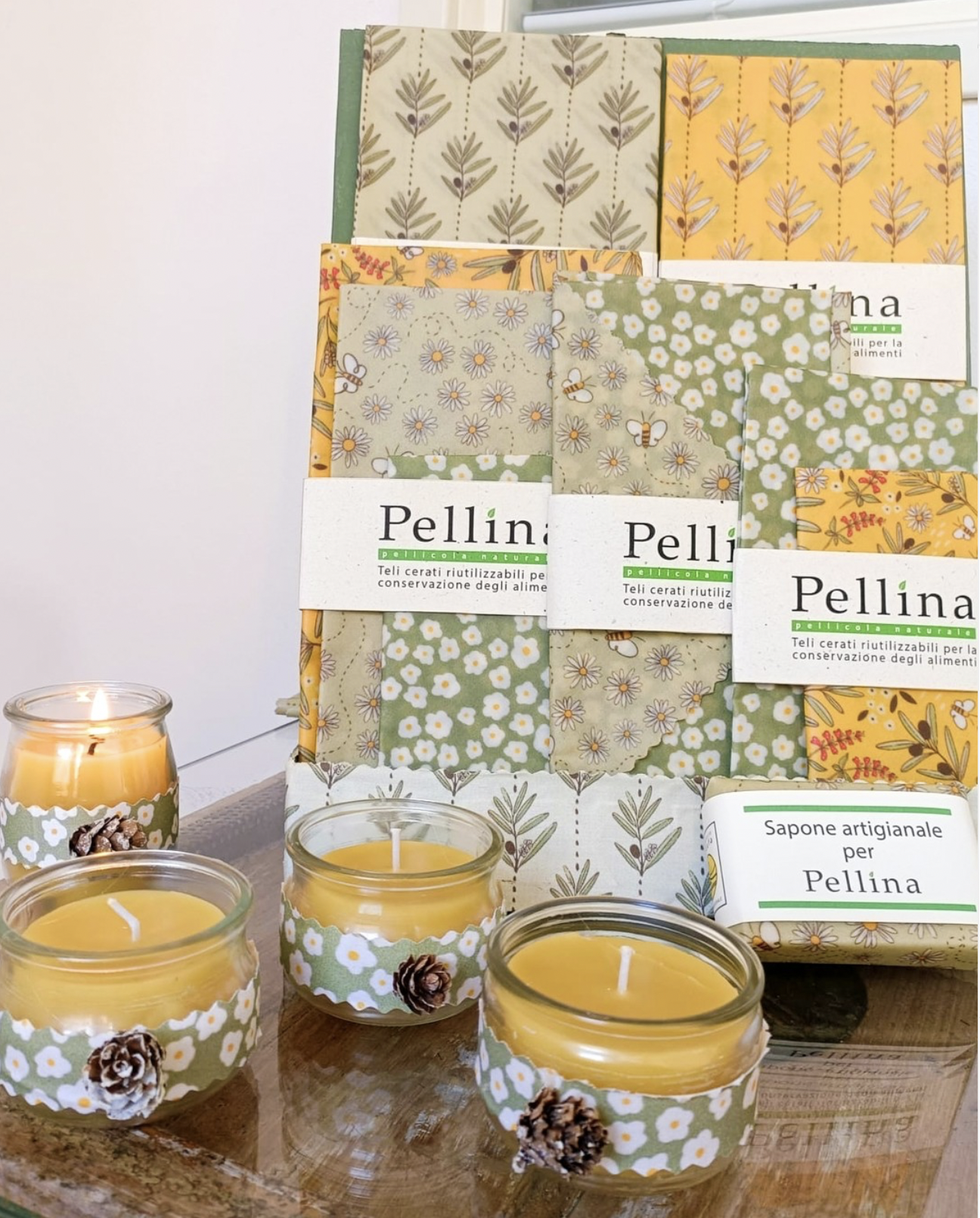
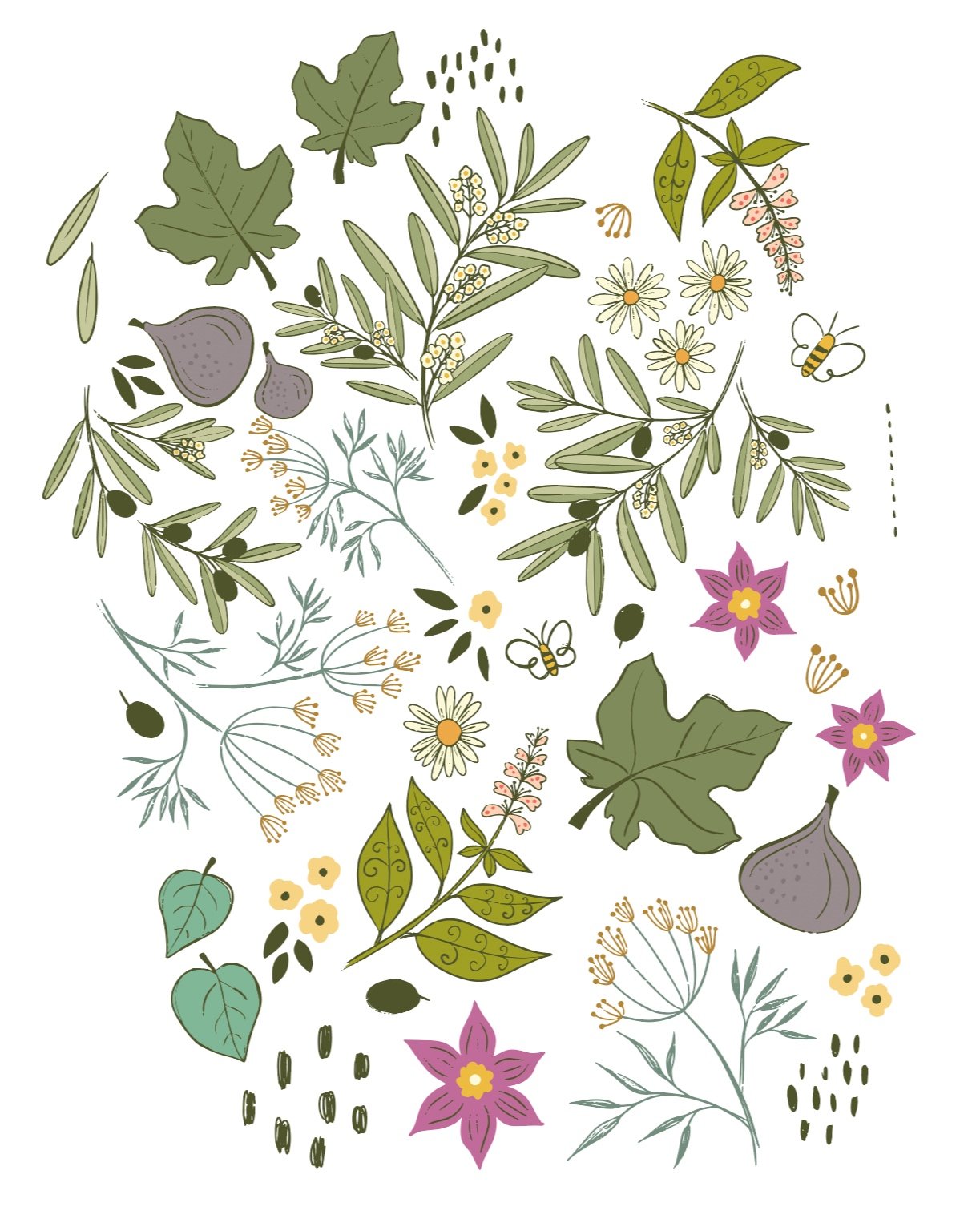
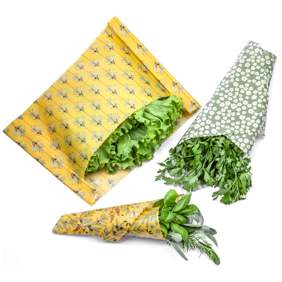
“Olive and Honey”, a fabric collection born from a collaboration with Laboratorio La Gufa.

From past experiences, I’ve found that design collaborations to create a new collection are fun way to fill my Spoonflower shop with more designs while helping me to learn more about what small business owners and makers need and why. For those I’ve collaborated with, it’s been an opportunity to see their vision come to life without the expensive design fees. When the designs are finished, they are uploaded to my Spoonflower shop and purchased as needed.
“Olive and Honey” is a fabric collection born from one such collaboration. Over the summer Giuliana of Laboratorio La Gufa reached out all the way from Italy. She makes beautiful reusable wax food wraps using organic cotton dipped in olive oil and beeswax. In the process, the fabric becomes much darker, often causing the designs to get lost. Her request was that I create a collection that could be mixed and matched and would allow the designs to stand out. After learning a little more about her product and hearing her ideas, I sent Giuliana some sketches and then rough drafts. Before long, the collection “Olive and Honey” was born! I follow Laboratorio La Gufa on Instagram and I have absolutely loved watching their reels and seeing photos of their products with my designs printed on them.
Visit Laboratorio La Gufa’s website and Instagram to buy their wraps and learn more about their process. Did I mention how much I love watching their reels?
You’ll find the rest of the collection my Spoonflower shop.

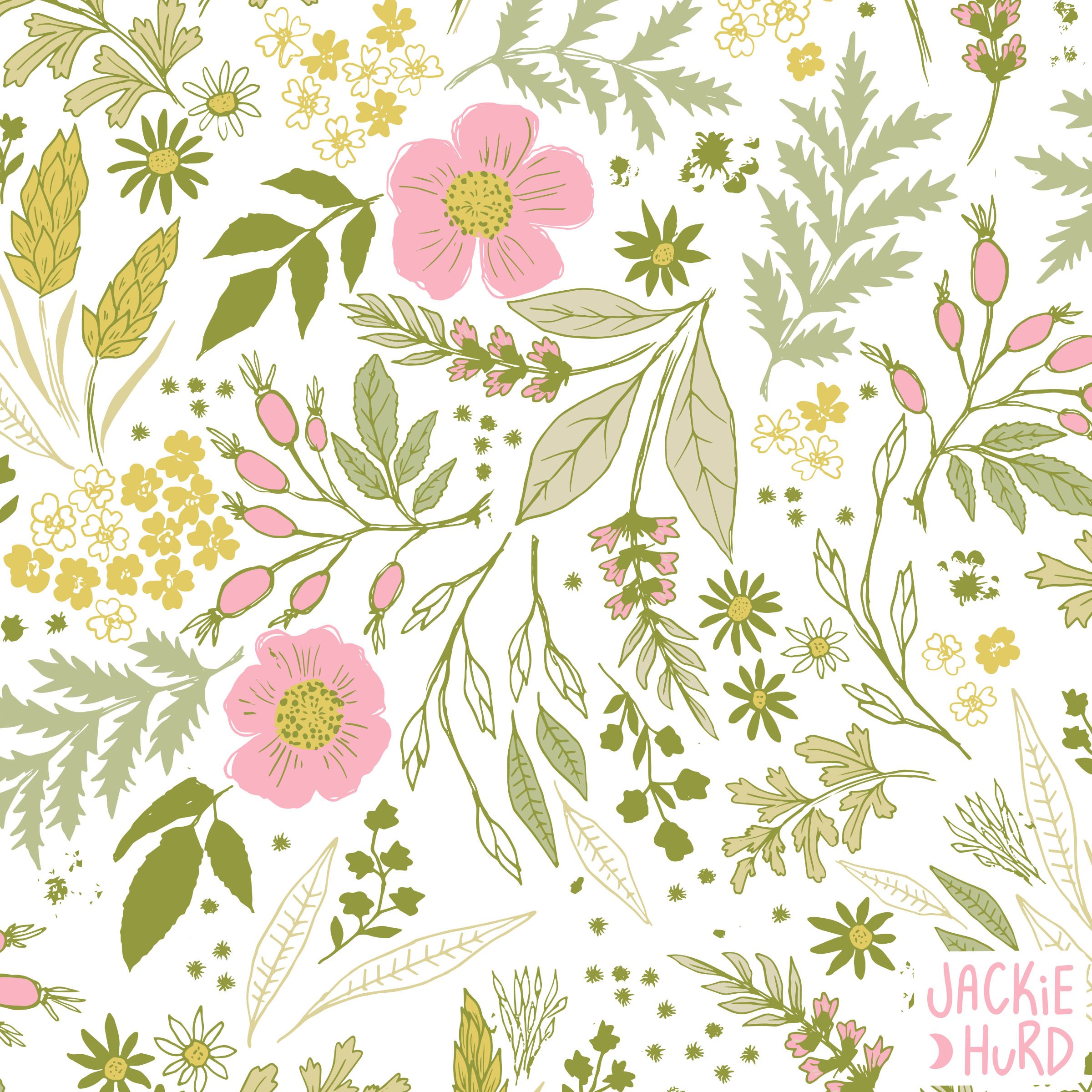
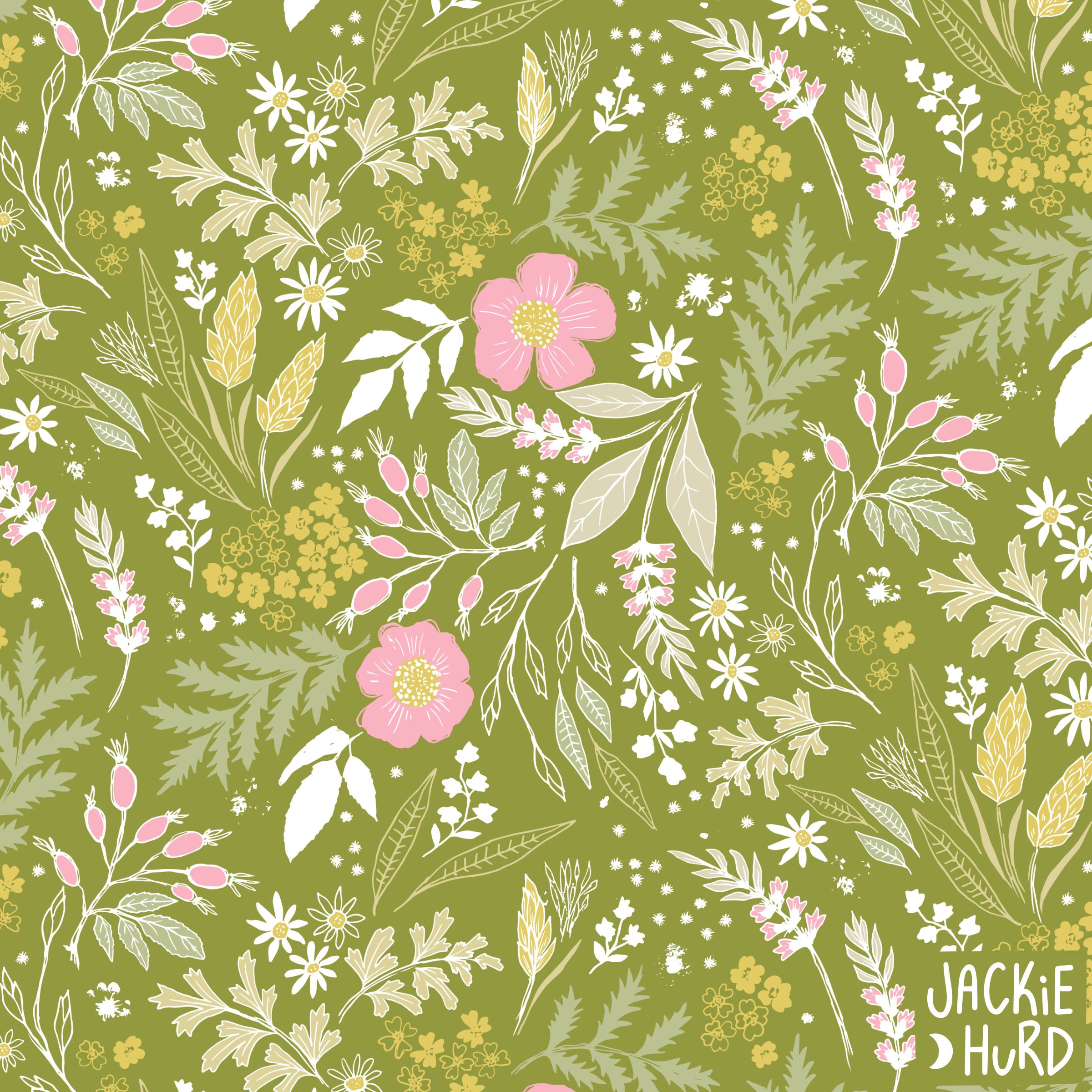
Floral No. 2232
Introducing Floral No. 2232, a fresh floral collection just in time for spring- or summer. I created two bolder, punchier color options of the main designs for the warmer months that can be used with the coordinates.
Introducing Floral No. 2232, a fresh floral collection just in time for spring- or summer. I created two bolder, punchier color options of the main designs for the warmer months that can be used with the coordinates.
After I received my sample prints for this collection from Spoonflower and compared them to my original illustration I was reminded (as I often am) of why I love pattern design, and why it’s become my primary method of creating. I created the original illustrations for this collection quickly with Indian ink and a pretty worn out nib that I’m just not ready to retire yet. There were mistakes, there were smudges. It wasn’t perfect. But sometimes in this form of art (or any form), those imperfections can bring opportunity. A lot of times in my process I create those imperfections intentionally. I often go over my lines twice, creating extra lines. When I can I work with Indian ink because it’s a little unpredictable- sometimes it drips, sometimes I accidentally drag my hand over a wet line- that smudge will add character later. After the illustrations are complete and I bring everything into the computer and start converting to vector, I end up with this little playground of icons packed with possibilities and the results are like a surprise, especially when I finish and then look at the original illustration next to the final products and think “all that from this?”.
Floral No. 2232 is available in my Spoonflower shop on fabric, wallpaper and home decor. A few designs from this collection are also available on products in my Redbubble shop.
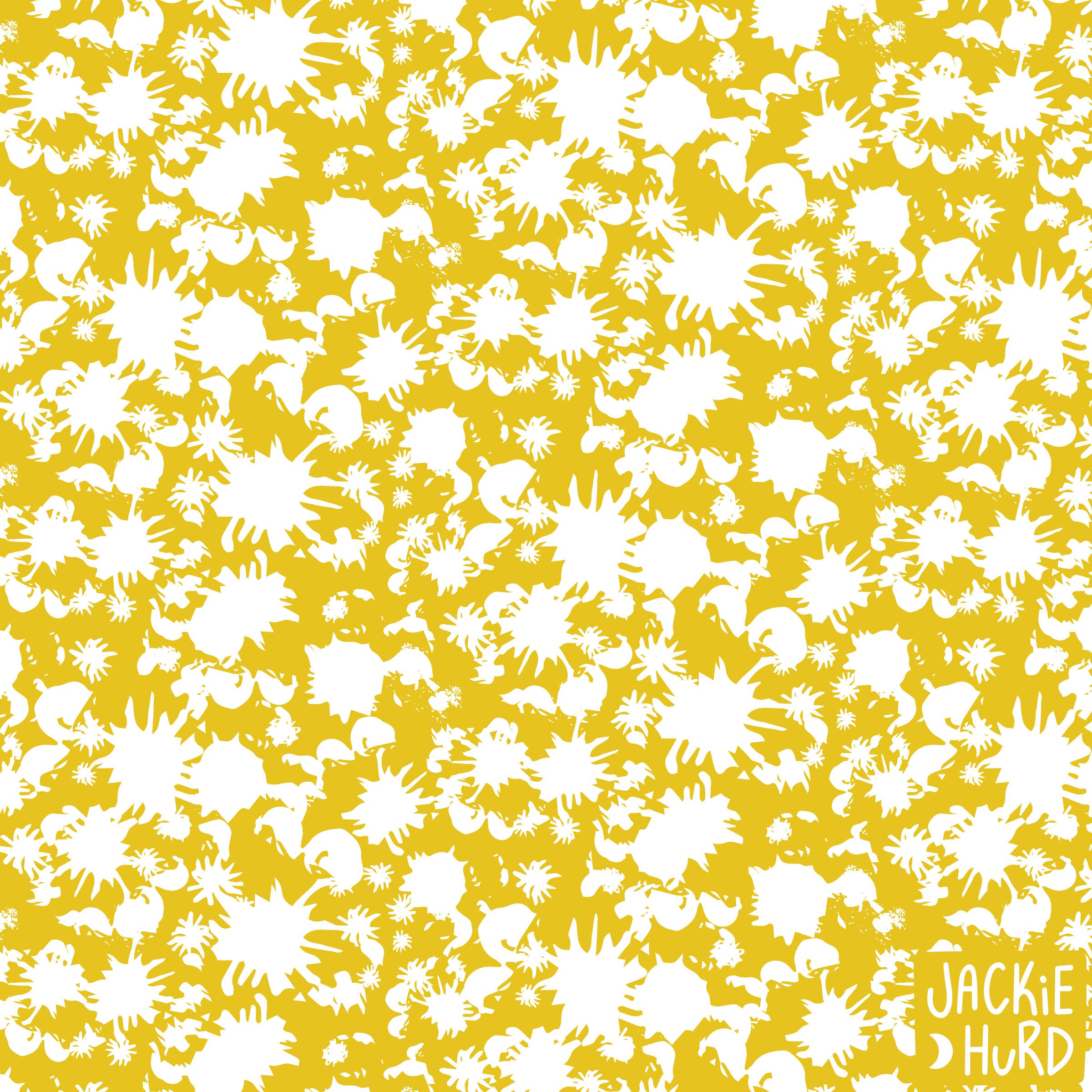


Home on the Saguaro, 17th Place!
This design placed 17th in Spoonflower’s “Home on the Range” challenge. Here’s the story behind this design and where you can find it on fabric and other products.
Home on the Saguaro, my design for Spoonflower’s “Home on the Range” challenge, took 17th place. When I originally read the prompt for this challenge I was stuck on cowboy hats and horses but when I was ready to work on my entry, I read through the prompt again and the word saguaro jumped out at me. A saguaro is that tall desert cactus with many upward reaching arms. I’ve never seen one in person but from the photos I’ve seen they look absolutely magical, so I decided that the subject of my design would be saguaro cacti and the little critters that live in them. Since this pattern placed top 60th, it was automatically made available for sale as fabric and wallpaper so it can be purchased in my Spoonflower shop. I’ve created some fun coordinates to go with this design, swatches have been ordered and they’ll be available by the 2nd week of May.

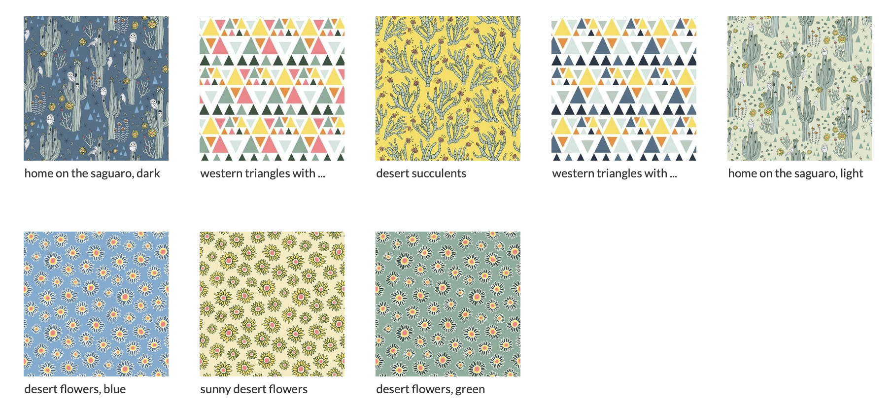

I drew the original artwork for this pattern with pen and ink.

Home on the Saguaro is also available on a variety of products in my Redbubble Shop.

Jalapeño Business
Beer label illustration for Dirtbag Ales’ Jalapeño Business. Here’s a summery of my thoughts and process on this one.
I probably shouldn’t play favorites because each beer label illustration I’ve done is special in its own way, but for now I’m just going to go ahead and call this one my favorite. I designed this one a while ago for Dirtbag Ales. When Dirtbag Ales’ Head Brewer/ co-founder, Tito told me about the name of this beer and his ideas for the label last summer, I knew immediately where I wanted to go with the design. My initial sketch was on paper and then I used a combination of Procreate (on my iPad) and Photoshop to illustrate this piece. As the scene started to develop through my drawing process, I became very attached to Mr. Super Serious Jalapeño and his annoyingly cool co-worker, the Pineapple. Even in the initial sketch their personalities were apparent and I added small details in the background to emphasize this. These characters have their differences, during the work day, I image there’s a constant battle of who’s got more flavor, and Mr. Jalapeño probably spend s a lot of time trying to get The Pineapple to focus and stop drumming pencils on the desk they share, but united in a beer, they work really well together. You can find this tasty American Wheat Ale brewed with Jalapeño and Pineapple at the Dirtbag Ales’ Brewery in Hope Mills, N.C. or contact the Brewery to find out if it’s available at any of your local grocery stores.


This was my initial sketch of the Jalapeño business label.

Humming Bird Charm
I created the main pattern for my Hummingbird Charm collection in September as an entry to Spoonflower's 500th design challenge, the prompt was Artistic Voice.
I created the main pattern for my Hummingbird Charm collection in September as an entry to Spoonflower's 500th design challenge, the prompt was Artistic Voice. I like to push myself to try different mediums, but when I think about my style and what my clients hire me to do, it’s this hand drawn look that usually starts with a pen (or a brush pen on my ipad) I’m not sure what to call it, but this is my default style and what I’m best at. When I saw the prompt to the artistic voice competition, I wanted to skip it because it was so wide open and I had way too many ideas floating around, but then I started thinking of hummingbirds. Then I started seeing these seemingly magical little birds buzzing around my garden every time I’d sit outside on my front porch to work. With everything that went on in my life last summer, they were a refreshing reminder to appreciate the small things in life that can easily be overlooked. I decided to do a little research and I was intrigued by the symbolism and history connected to hummingbirds. Hummingbirds also seemed fitting because I am naturally drawn to pollinators and tend to create a lot of pollinator themed art and patterns.
I created this collection with warm sunny days in mind. I included a deep bold yellow and a punchy pink in the main pattern that combined seem to have such a summery feel good vibe. It’s available on fabric and wallpaper in my Spoonflower shop and I can see this hummingbird fabric being sewn into cute little ruffle bottomed one piece bathing suits or possibly sundresses for little girls.
This collection is available for sale in my Spoonflower shop on fabric, wallpaper and an assortment of home decor items.
Click here to shop the collection.


Here’s the original line drawing. I drew it using the procreate app on my iPad.

Produce Illustrations for Freshlist
Fruits and vegetables are at the top of my “favorite things to draw list”. I was very happy when a project in the form of fruits and vegetables came my way back in August when I got an illustration request from a Charlotte, NC based food delivery company called Freshlist.
Fruits and vegetables are at the top of my “favorite things to draw list”. I was very happy when a project in the form of fruits and vegetables came my way back in August when I got an illustration request from a grocery delivery company in Charlotte called Freshlist. One of the founders, Jesse, reached out and asked if I would be interested in illustrating produce for a giant seasonal clock he planned to have painted on the side of the Freshlist building. Of course I was interested! When it was time to start the project, Jesse sent me over a list of over 50 produce items- it was like a long grocery list but instead of delivering groceries I was to deliver persimmons, kumquats, okra, lemons, limes, collard greens and more in the form of vector illustrations. There were a few things I had never heard of like Paw Paw fruit and that took me down the rabbit hole of information, especially when I realized I could potentially find a paw paw tree in the woods near my house. I drew a few of each item on the list by hand using a .01 Pigma Micron pen. Freshlist is a company with a very down to earth organic vibe- they work directly with local farmers and food makers to deliver fresh, local food to their customers, so I wanted my illustrations to have that same feel to them. After everything on the list was drawn and approved I converted the drawings to vector and added color. These illustrations were then turned over to a local Charlotte artist who did an amazing job painting them onto the wall. The finished product is a large, colorful and functional seasonal clock. I love projects like this and it’s a great feeling to know I was able to play a role in contributing to the beautification of a community.
To learn more about Freshlist, visit Freshlist.com


